


Data visualization is a powerful tool that can be used to communicate complex data in a way that is easy to understand. By transforming data into visual representations, such as charts, graphs, and maps, data visualization can help decision-makers identify trends, patterns, and outliers. This information can then be used to make better decisions about business strategy, product development, and marketing campaigns.
Basic Plots
Basic Plots are versatile and can be used for displaying trends, comparing values or categories, showing relationships between variables, visualizing distributions and outliers, presenting time series data, and illustrating proportions and compositions.
This table offers a simplified overview of basic visualization types, their use cases, and the applicable data types, helping you choose the right visualizations for your categorical or numerical data.
| Type | Use Case | Type of Data |
| Scatter Plot | Examining relationships and correlations between two continuous variables, Visualizing clusters or groups within data points, and Identifying outliers and anomalies. | Numerical |
| Line Plot | Comparing multiple variables or groups on a continuous scale, Showing patterns and fluctuations in data, | numerical |
| Box Plot | Effective for understanding the distribution and spread of numerical data. They can help compare multiple groups or categories and identify outliers and skewness. | numerical |
| Bar Chart | commonly used for comparing categorical data or groups. They display the frequency or distribution of categorical variables and can also be used to present rankings or ordered data. | categorical, numerical |
| Heat Map | useful for visualizing matrix-like data or correlation matrices. They highlight variations and patterns within a dataset, enabling the identification of clusters or similarities. | categorical, numerical |
| Pie Chart | ideal for illustrating proportions or percentages of categorical data. They provide a clear representation of the composition or distribution of parts within a whole. | categorical |
| Time Series Graph | By plotting the data points in chronological order, time series graphs provide a visual representation of how the variable changes over time and enable the identification of seasonal patterns, trends, or other time-dependent phenomena. | numerical |
Time Series Graph
Time series graphs are visual representations of data that show the change in a variable over a specific time period. There are several types of time series graphs that offer different ways to analyze and interpret temporal data.
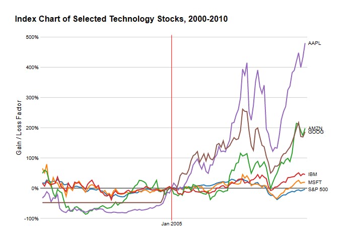
Index charts are time series graphs that display the performance of a single variable over a specific time period. They are commonly used in finance to track stock prices or market indices. They provide insights into trends, patterns, and fluctuations in the variable over time.
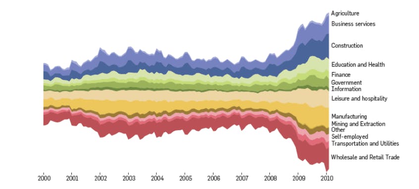
Stacked graphs visually represent the composition and cumulative values of multiple variables over time. Each variable is represented as a separate layer, and the total height of the graph represents the cumulative value of all variables at a given time. Stacked graphs are useful for comparing the contribution of different variables to the total over time.
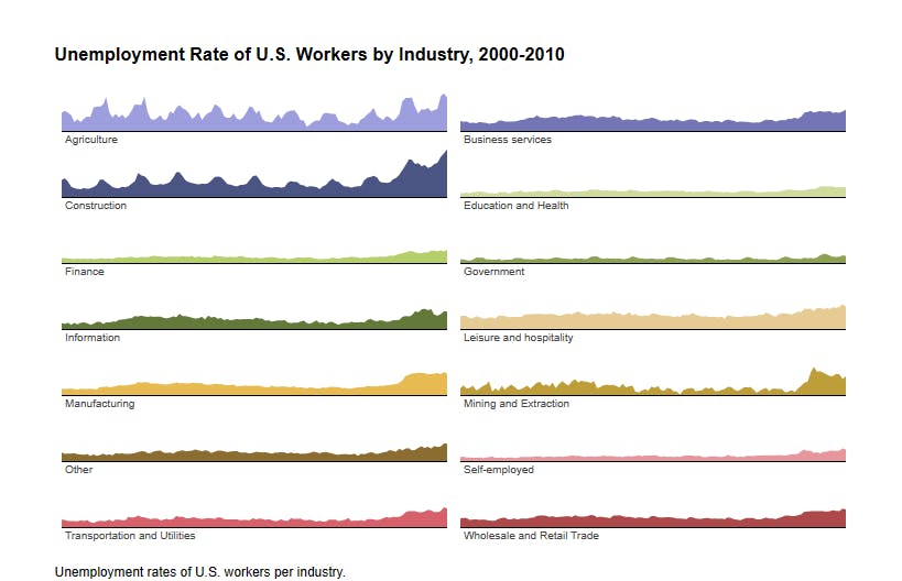
Small multiples, also known as trellis or panel charts, display a series of similar time series graphs, each representing a different subset or category of data. Small multiples enable easy comparison between different subsets and facilitate the identification of patterns, trends, or anomalies across multiple time series.
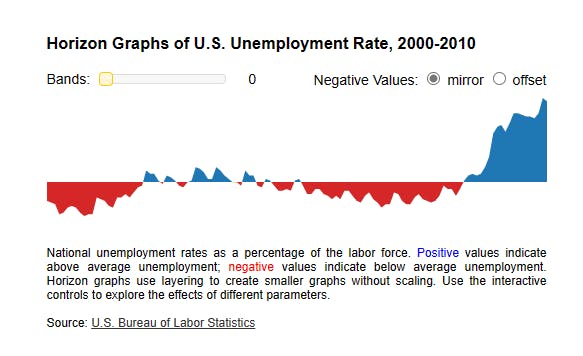
Horizon graphs are compressed time series graphs that stack positive and negative values on top of each other. They use color gradients to represent the magnitude of values, allowing for efficient visualization of trends and anomalies within a compact space. Horizon graphs are particularly useful for displaying large amounts of time series data while preserving detail.
Statistical Distributions
Statistical Distributions are useful for analyzing data distribution and skewness, examining probability density functions, assessing data variability and spread, identifying outliers and anomalies, and understanding data uncertainty and confidence intervals.
| Type of Statistical Distribution | Use case | Application |
| Stem and Leaf Plot | useful for visualizing the distribution and individual data points of a dataset. | They can be employed to analyze student grades or display earthquake magnitudes. |
| Scatter Plot Matrix | allows for examining relationships between multiple variables in a dataset. | It is useful for exploring correlations among variables or analyzing customer purchase behaviour. |
| Parallel Coordinates | effective in visualizing multivariate data and exploring relationships among variables. | They can be used to analyze and compare data from different cities or evaluate performance across various metrics. |
| QQ Plot | commonly used for comparing observed data against a theoretical distribution. | They help check if data follows a normal distribution or testing data conformity to a logistic regression. |
Maps
Maps, on the other hand, are specifically designed for visualizing geospatial data and patterns, displaying regional or global data distributions, illustrating demographic or socio-economic information, and presenting data in the context of geography, such as sales by region or disease prevalence by country. They are out of the scope for this blog.
Hierarchies
Hierarchies refer to the organization and representation of data in a hierarchical structure. Hierarchies are used to show relationships between different levels of data, where each level is a subset or category of the one above it. They provide a way to understand the hierarchical structure of the data and enable users to explore and analyze the data at different levels of granularity.
Networks
In the context of data visualization, networks, also known as network graphs or network diagrams, refer to visual representations of interconnected elements or entities. Networks are used to illustrate relationships, connections, and interactions between various entities, such as individuals, organizations, or concepts.
In a network, entities are represented as nodes or vertices, while the relationships between them are represented as edges or links. The nodes can be connected to one another through directed or undirected links, indicating the nature and direction of the relationships.
Networks can be used to analyze and visualize various types of data, including social networks, transportation networks, biological networks, and more. They provide a powerful means of understanding the structure, patterns, and dynamics of complex systems.